Beit Arabi

Beit Arabi is an interactive Arabic language learning center for children. Our website offers a playful and informative experience for parents to explore our programs, book classes, and understand how we make learning Arabic fun, engaging, and effective through creativity and personal growth.

client
role
Year
Client Brief
Beit Arabi is a modern Arabic language learning center designed for children. It offers in-person interactive Arabic lessons through a playful, immersive, and engaging educational environment. The center’s mission is to make learning Arabic fun, effective, and emotionally rewarding — both for children and their families.
Key Objectives:
Develop a joyful and professional visual identity that appeals to both kids and parents
Reflect the center’s creative, balanced, and experiential approach to teaching Arabic
Design a website that serves as a trusted digital gateway for class information, booking, and parent engagement
Build a social media strategy that promotes trust, showcases real classroom moments, and supports growth
The Design
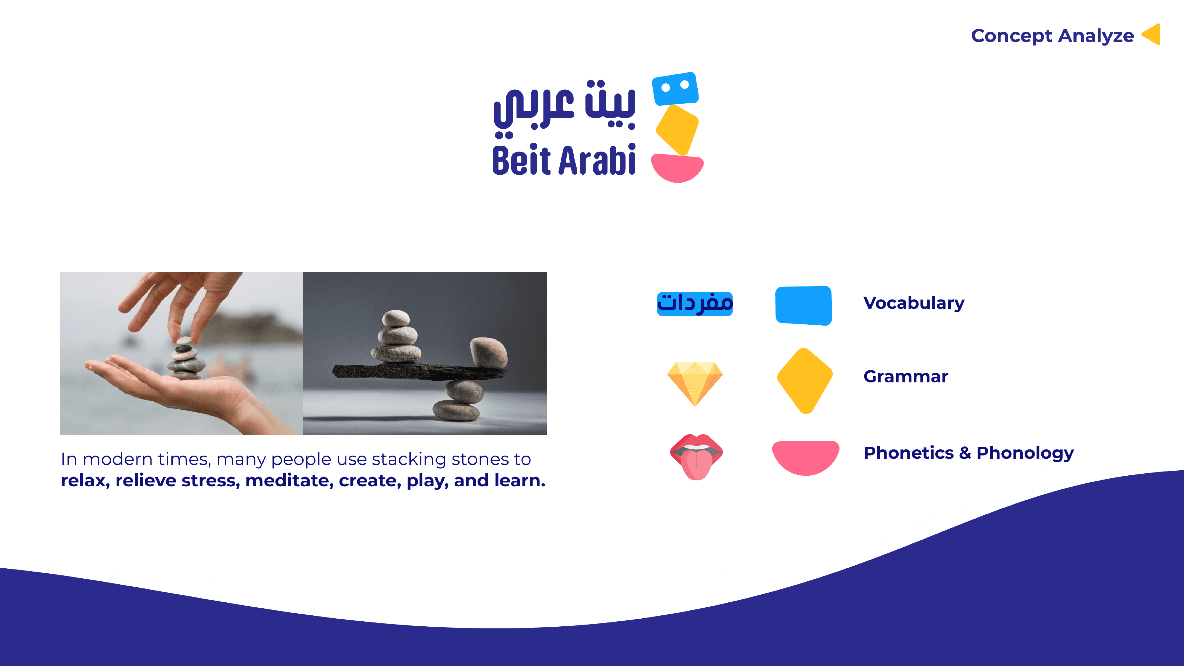
Core Concept: “Rock Balancing”
Inspired by the meditative act of balancing stones, the identity represents the three foundational pillars of Arabic learning at Beit Arabi:
Vocabulary (blue)
Grammar (yellow)
Phonetics & Phonology (pink)
Each shape is playful and abstract, rooted in Arabic letterforms and diacritic symbols, representing how the center builds a strong linguistic base in a fun and visual way.
Brand Personality:
Lively – Reflecting the energy of young learners
Exciting – Capturing the curiosity of discovery
Imaginative – Encouraging creative thinking
Daring – Pushing the boundaries of traditional Arabic education
Logo System:
The logomark balances three colorful abstract shapes into a character-like figure. It feels child-friendly, modern, and playful, while still professional and trustworthy for parents.