Right Bite

Right Bite is a health-focused restaurant brand that combines playful visual language with a strong nutritional message. It offers a wide variety of wholesome, flavorful dishes designed to promote healthy eating habits. The brand identity centers around a cheerful mascot and a retro-inspired design language, appealing to modern consumers who value both nutrition and personality in a food brand. The experience spans digital presence (website, social media) and physical touchpoints (packaging, prints), reinforcing the brand promise: Healthy & Delicious.

client
role
Year

Client Brief
Objective: Build a vibrant, lovable brand that positions healthy eating as fun, engaging, and flavorful.
Target Audience: Health-conscious young adults, families, and working professionals looking for accessible, tasty wellness meals.
Requirements:
Develop a playful yet credible visual identity.
Design packaging and touchpoints that feel personalized and delightful.
Create a user-friendly website that highlights nutritional transparency and easy ordering.
Launch engaging social media content to drive interaction and loyalty.
Include the brand’s emotional core: a personal connection with the inspiration (Soso).
Design Direction
Visual Language:
Friendly retro aesthetic with warm, saturated colors (mustard yellow, tomato red, leafy green).
Custom mascot/logo representing a character giving the "OK" bite gesture – memorable and full of character.
Use of playful icons (OMG, nom nom!) and stickers as brand accents across all platforms.
Typography & Layout:
Rounded, bold typefaces with strong personality.
Simple, joyful hierarchy emphasizing ease of navigation and instant readability.
Packaging & Prints:
Consistent use of repeating brand patterns, stickers, and messaging like “Enjoy Your Meal!”.
Integrates QR code and CTA seamlessly with the character for on-table conversion.
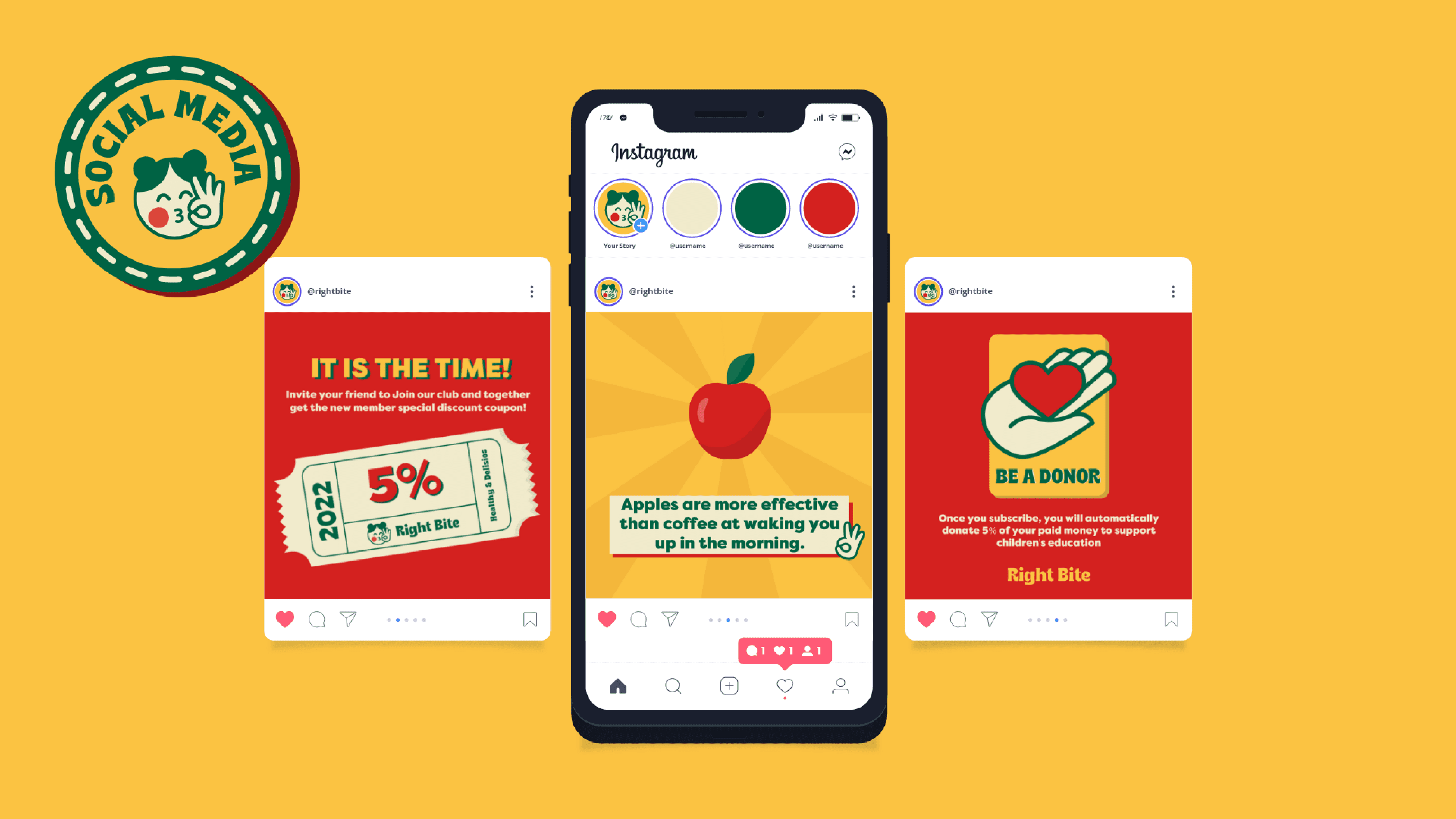
Digital Experience:
Clean, colorful product layout highlighting dish ingredients and nutritional macros.
Gamified feel with interactive UI elements and quirky micro-copy (“nom nom!”).
Emotional Branding:
Anchored in personal storytelling (inspiration from Soso).
Aligns the idea of nourishment with emotional care and childhood warmth.